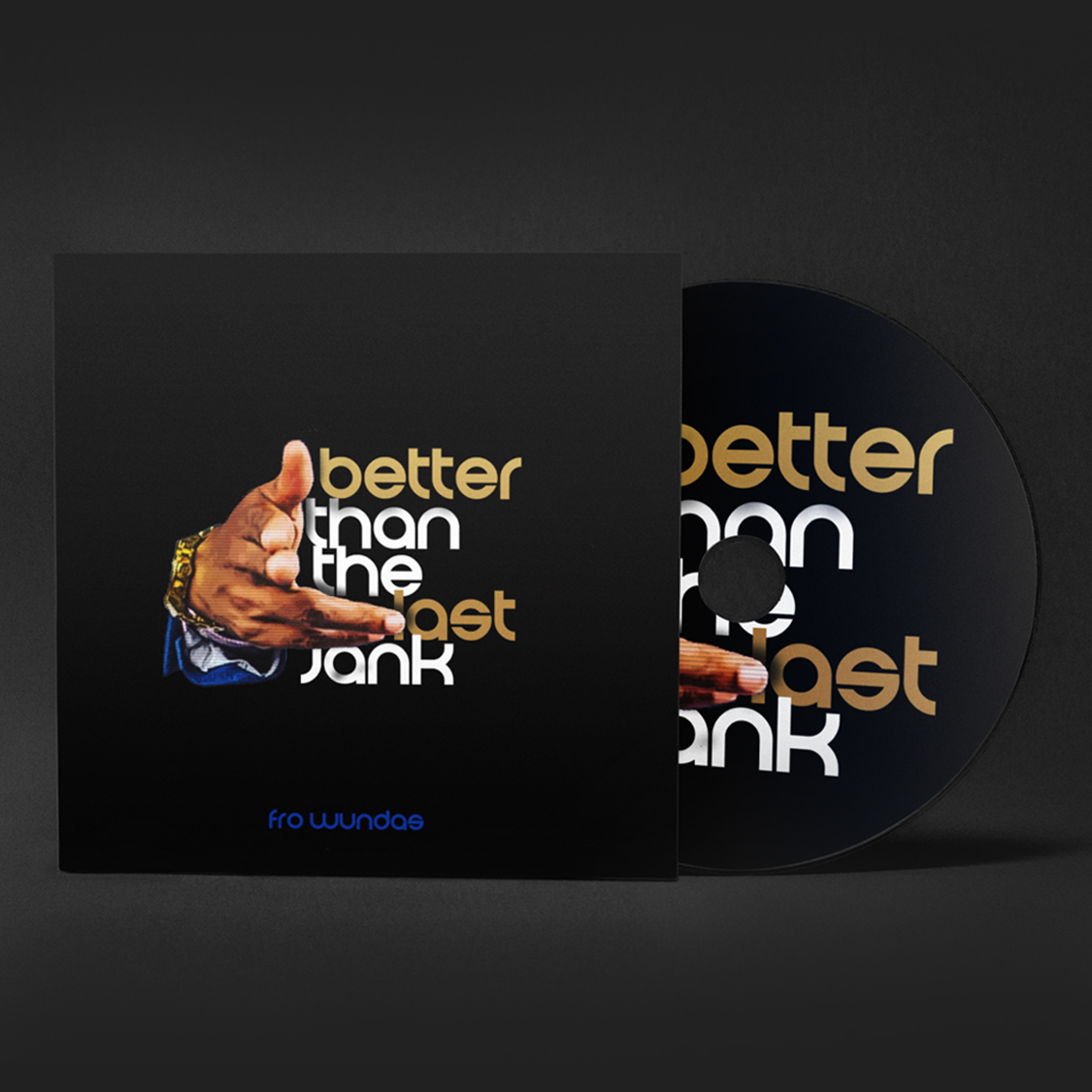
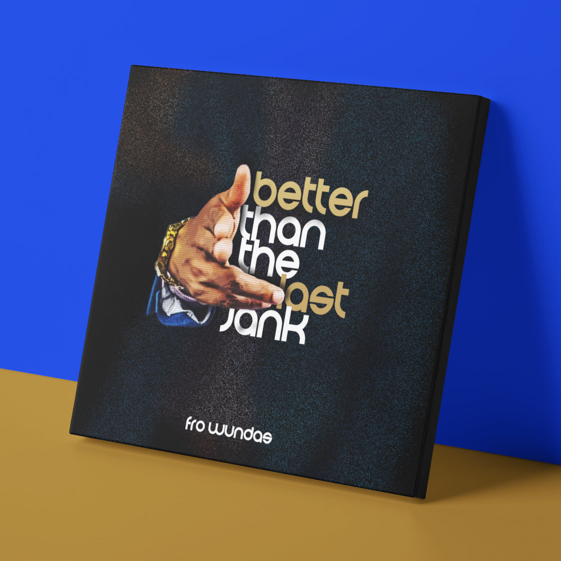
Better Than The Last
Artist Branding | Digital Product Design


WHAT I ENJOYED…
When this artist shared the album title with me I knew I wanted to play it up differently. The title was so informal linguistically that I wanted to use a super clean design. He sent photos of himself dressed formally and to play it up in a more subtle way I only used his hand. I sent a couple options of text. He loved them all.
Fonts / Typography
Elegant Lux
ABCDEFGHIJKLMOPQRSTUVWXZ
abcdefghijklmnopqrstuvwxyz
1234567890
Color Palette
Sometimes, smash things up!
MONA J™
© 2021. All rights reserved. All other copyrights/trademarks are property of their respective owners.