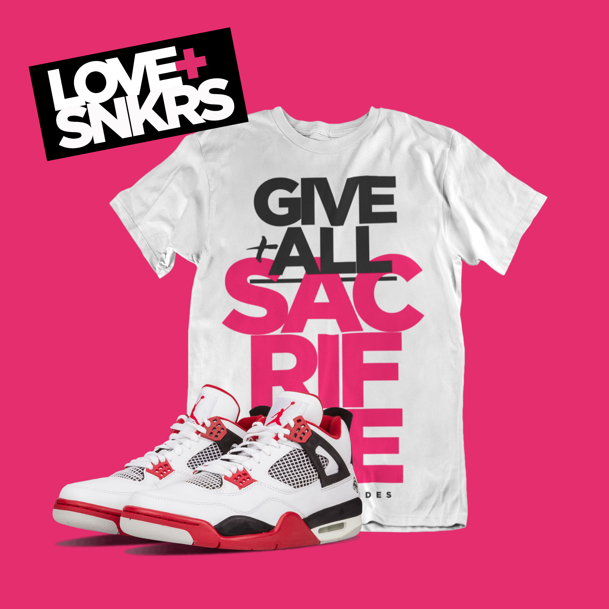
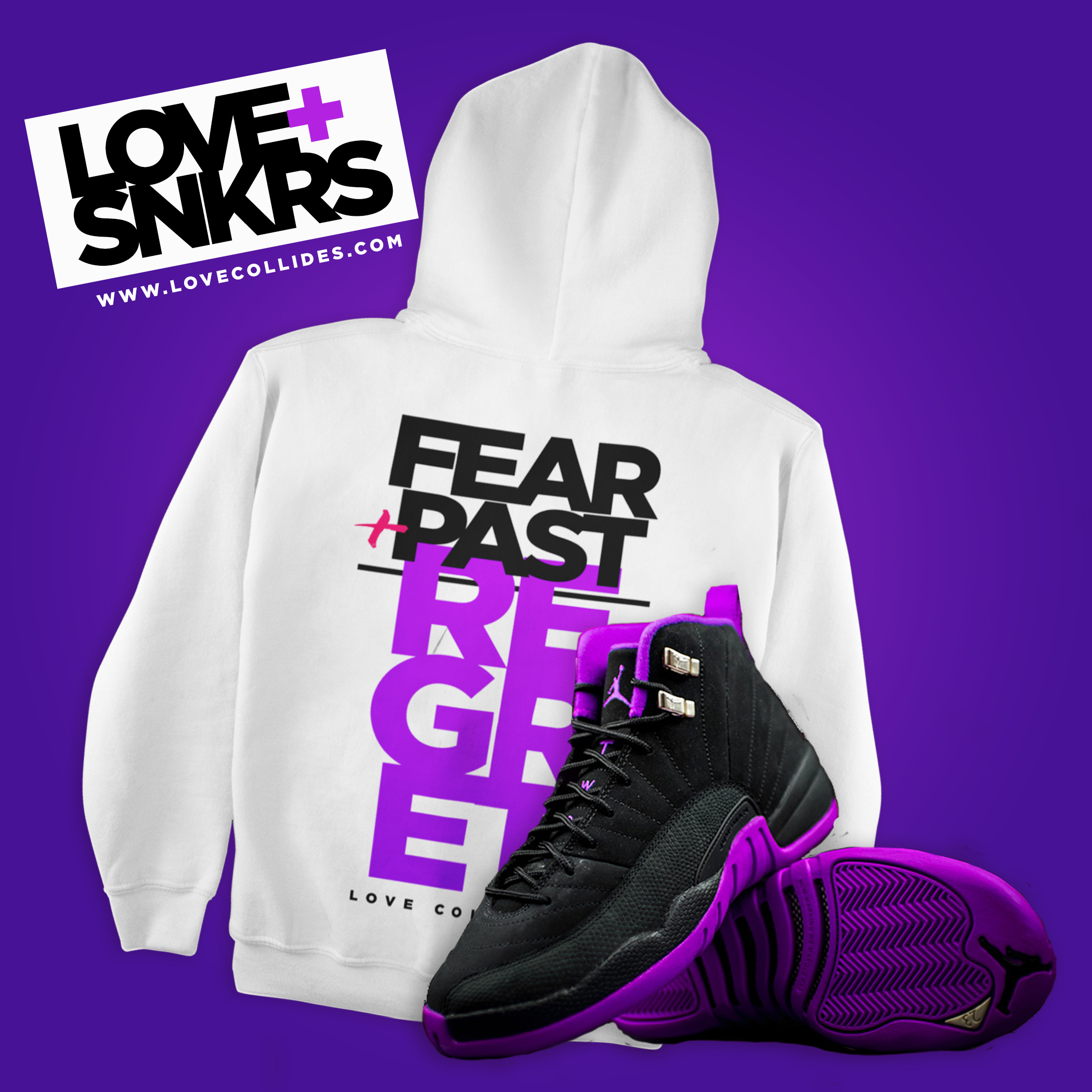
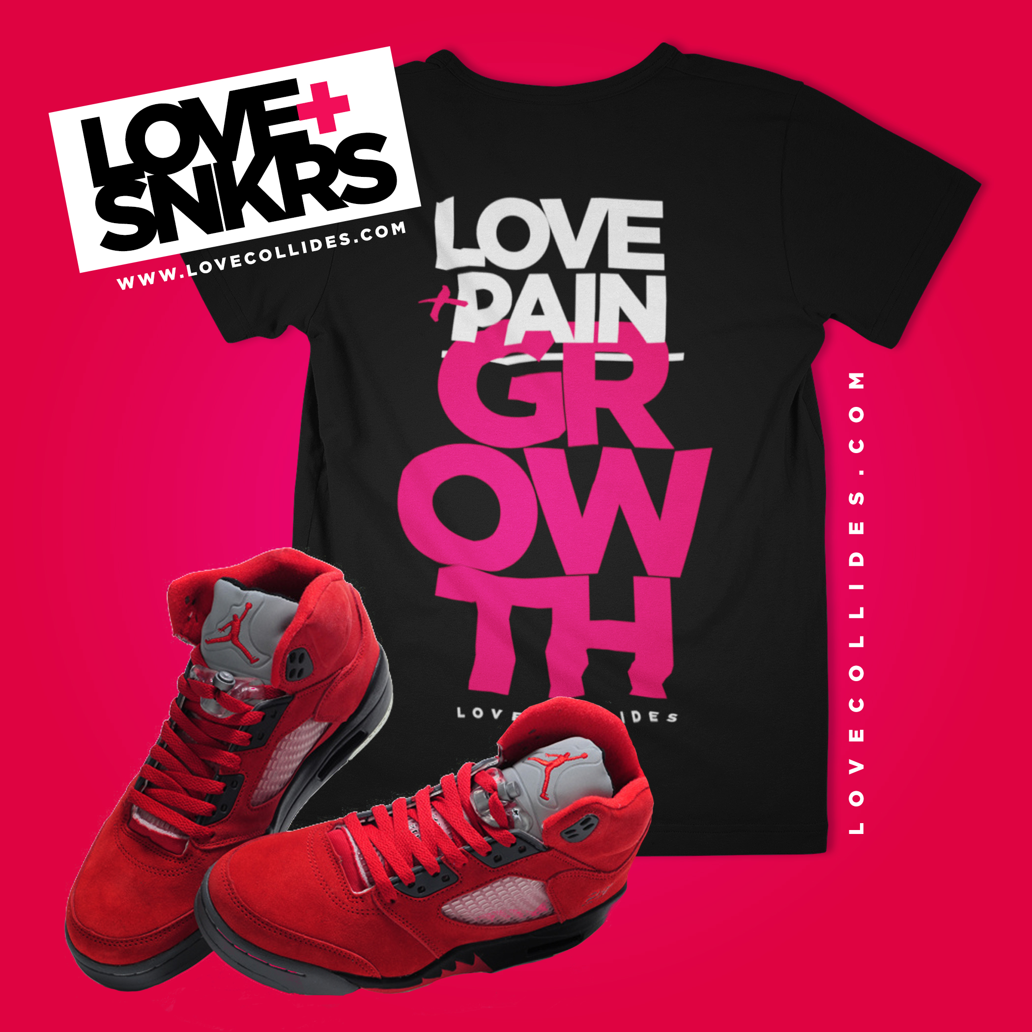
Love+SNKRS
Marketing Campaign | Kicks, Tees & Color


WHAT I ENJOYED…
So I always enjoy the opportunity to get bold with typography and color. This company wanted bold, “tex- heavy” t-shirt designs with strong powerful color combinations. I had so much fun without the concern of hierarchy. I played around with some colors and kept “fusion” at the forefront of my mind. Client loved it!
FONTS ARE JUST PLAIN SEXY.
MONA J™
© 2021. All rights reserved. All other copyrights/trademarks are property of their respective owners.


